
Update, 11 April 2020: Six years after writing the material below, I came up with a much better way of doing this and it took me a lot less time to get there.
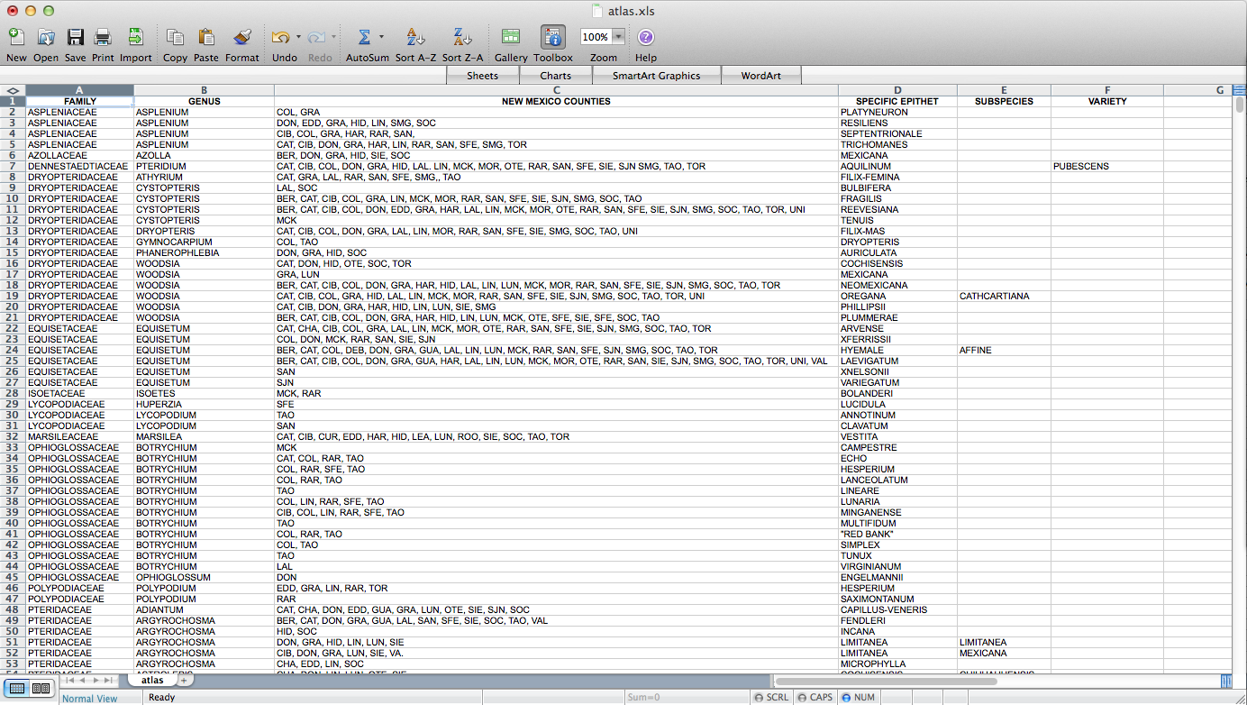
Fun with QGIS! I figured out how to make a set of ca. 4000 county-level distribution maps for plants in New Mexico. These will eventually be part of Ken Heil & Steve O’Kane’s New Mexico flora project. Given that this is not a straightforward task, I thought I’d put a description of the process (including some wrong turns–I might leave those out next time) up here for my future reference. Maybe someone else will find it useful as well. Probably not, but who knows? So, Ken sent me a spreadsheet he’s put together that includes a list of species in the state with county distribution entered as a list in one of the columns. He has the data in a FileMaker database. I don’t really know what it looks like in there, but this is what it looked like when it got to me:
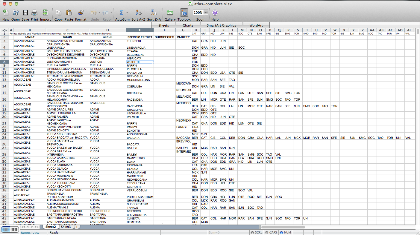
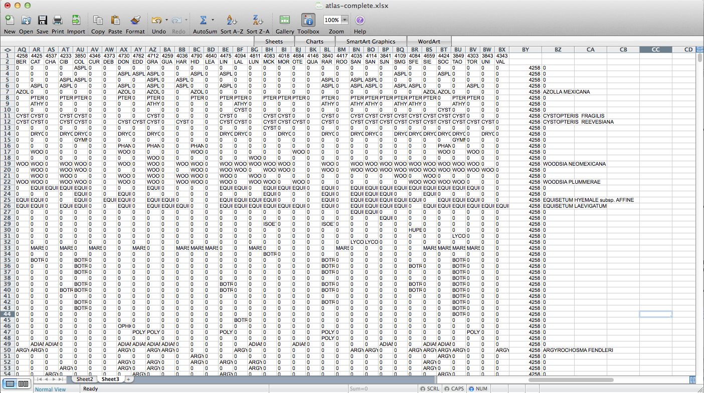
So, the first step – I had to figure out how to get this data into a form in which I can get it into QGIS. A presence / absence matrix seemed like a good idea, so I turned the cells with lists of abbreviated counties into a set of columns (via exporting as CSV, deleting all the field-delimiting quotation marks, and loading back into Excel):
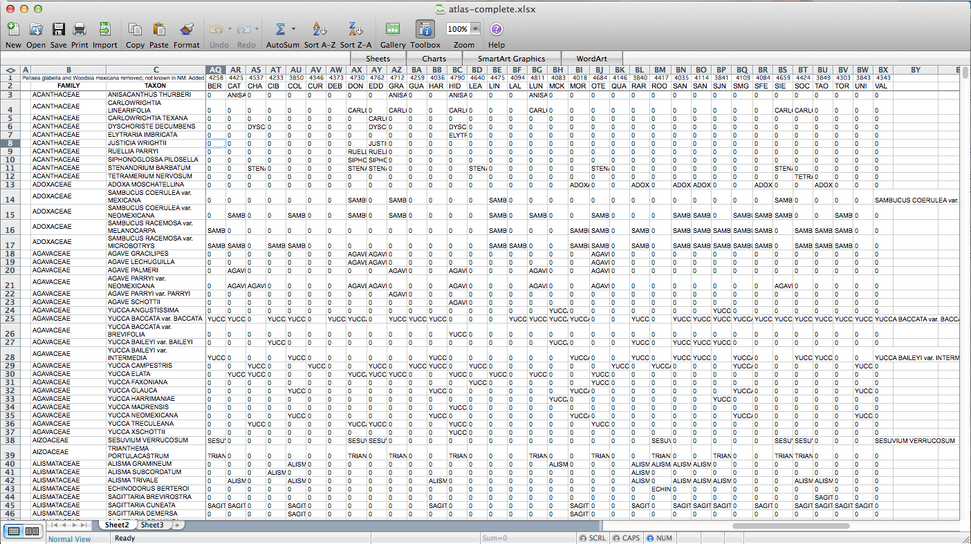
Then I used all those columns to populate a matrix, via the following formula: “=IF(ISERROR(MATCH(“BER”,$H3:$AP3,FALSE)),”0″,$C3)”. “BER” is the county (Bernalillo) for this column of the matrix, “$H3:$AP3” is the range of cells listing counties for the plant on this row, and “$C3” is a cell containing the name of the species. So, if “BER” is in the county list, it returns the name of the species (I’m using the name as a marker for presence for reasons that will become clear later on–I used “1” initially, but that doesn’t end up working); if not, it returns “0”. I end up with something like this:
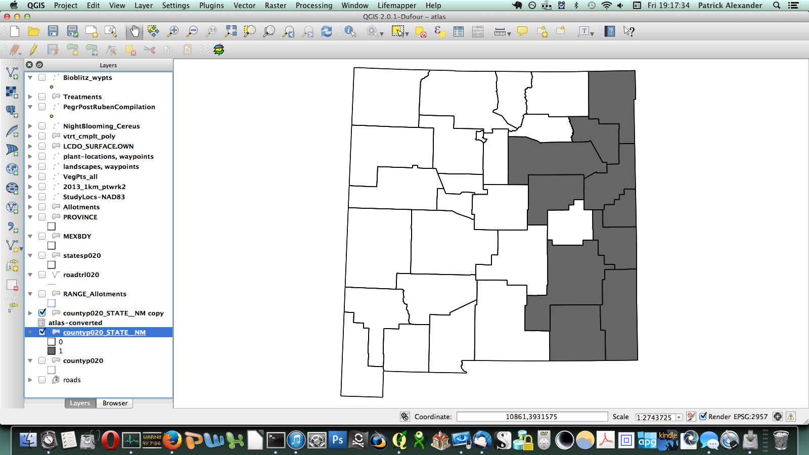
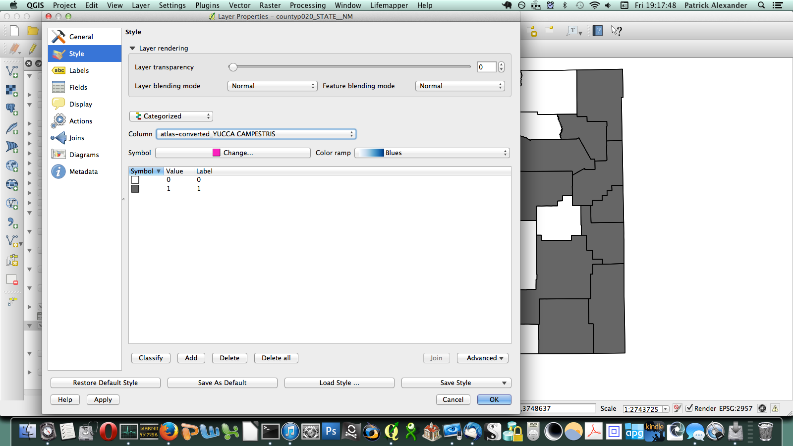
After poking around online for a while, I figured out that if I transposed this matrix (so it has a column of counties on the left and a row of species at the top) I could send it to a CSV, load it in QGIS, and join it to a vector layer I have for county boundaries of New Mexico. All the plants ended up in a long list of attributes for the county layer. Then through conditional layer styling, the counties can be set to grey if the species is present and white if it is not, like this:
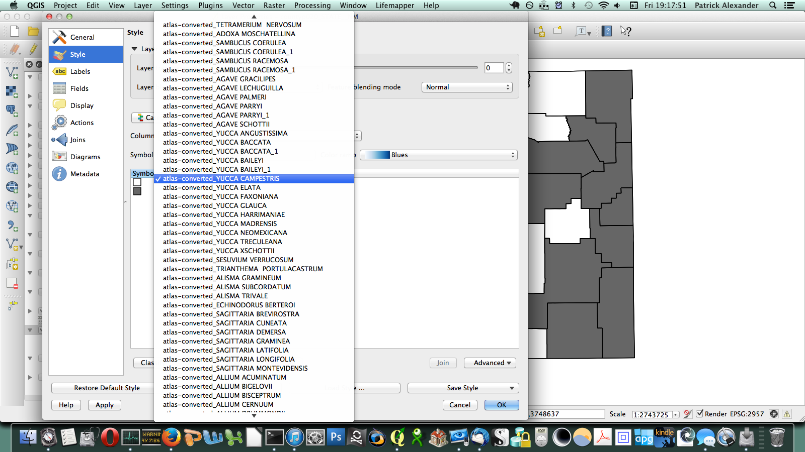
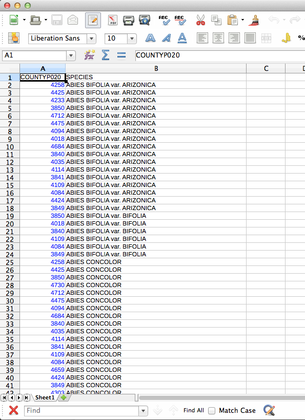
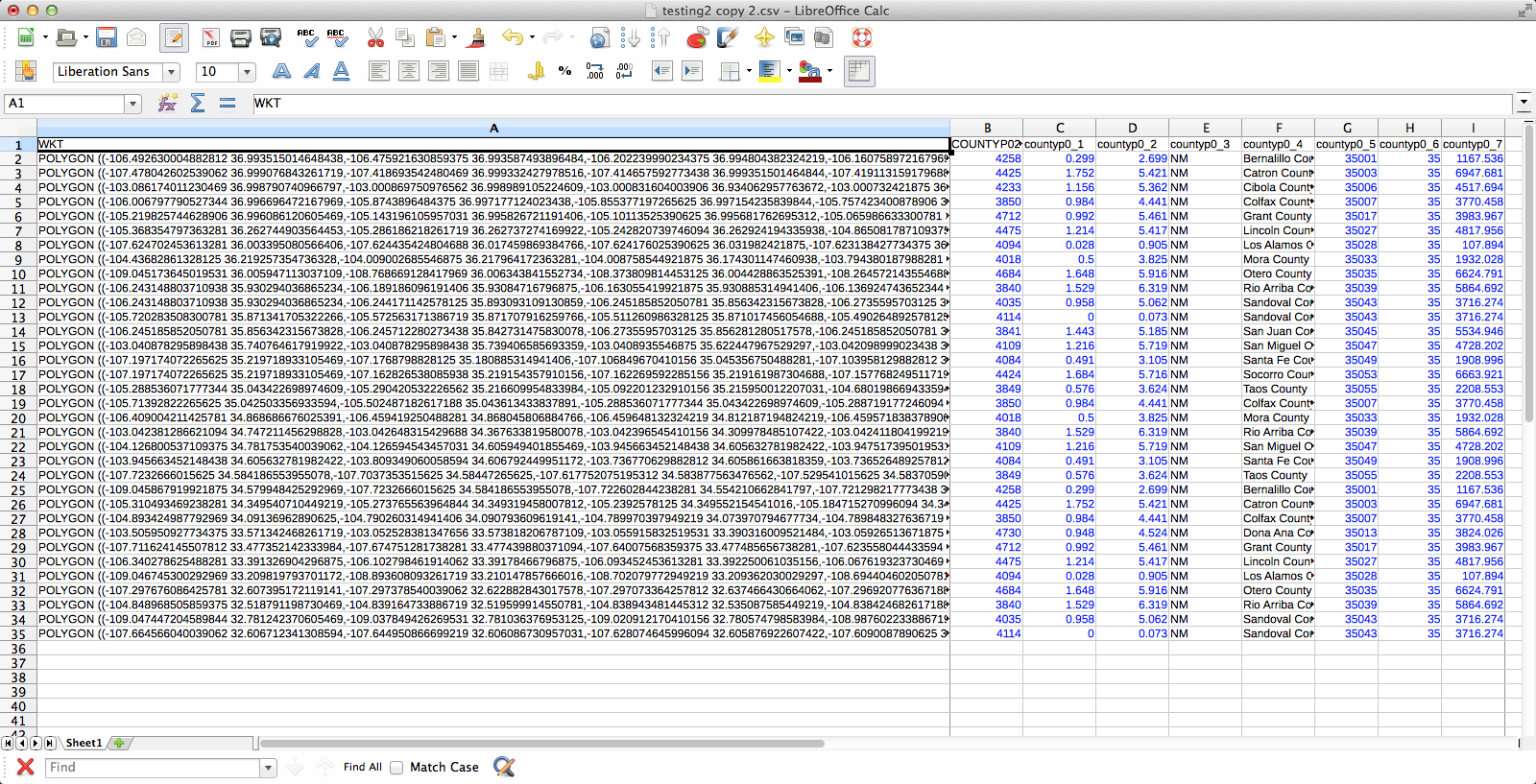
That worked, but going through every species in the layer dialogue would take an extremely long amount of time. There are a few different options out there for automating map generation in QGIS, but I couldn’t find anything that would work for my purposes. I wanted to be able to open up the Print Composer, get things set up, and tell it, “Take this layer here, and cycle through all its attributes, generating an image for each one.” The Atlas Generator in QGIS can iterate map generation across features (rows) of a layer, but not across attributes (columns). That’s as close as I could get. Having hit a brick wall, I went to StackExchange and user underdark very helpfully pointed me in the right direction. Instead of trying to figure out how to iterate across attributes, it’s easier to work with the existing functionality and get each plant species’ distribution into QGIS as a feature in a vector layer. It would not have occurred to me that you could do this, never mind how. First, I needed to transform my data so that it has only two columns: the first is a county identifier (for which I used a 4-digit ID already present in my county vector layer) and the second is the name of a species. Each presence/absence cell in my matrix becomes a row. The second column can be generated from my matrix using the following formula in Excel: “=OFFSET($AQ$3,MOD(ROW()-ROW($BX$3),ROWS($AQ$3:$AQ$4400)),TRUNC((ROW()-ROW($BX$3))/ROWS($AQ$3:$AQ$4400)),1,1)”. To be perfectly honest, I don’t understand exactly how that formula works–I modified it from a template in one of the online Excel help fora (I’d put a link here but I forgot to bookmark it)–but it takes each column from my matrix and stacks them into one huge column. The first column I generated by hand; it’s just 34 big chunks of a 4-digit code, so that’s not too painful. I end up with this:
I deleted all the “0” rows (QGIS doesn’t need to know where plants aren’t and the whole shebang was 149,000 rows–it went down to 36,000 after removing the null rows), exported those two columns (BY & BZ) into CSV, and off I went to QGIS to try to join it to my county vector layer. There’s a slight problem here–these two tables have a one-to-many relationship. Each county has one entry in the county layer, but appears hundreds of times in my county/species CSV (once for each plant recorded from the county). When I naïvely joined them in QGIS, only one of the rows from my CSV was matched to each county, and the rest disappeared. Unhelpful. Fortunately, I was not the first person to encounter this problem and I found a helpful tutorial explaining the process. The short version is that I had to export the county vector layer to CSV with the shape information formatted as well-known text (via “GEOMETRY=AS_WKT” in the layer field) and then use my county/species CSV as the “parent” to which the new CSV-ified county layer is joined. Apparently, QGIS is perfectly happy joining tables with a many-to-one relationship; it just doesn’t do one-to-many. Also, because all the shape information is just a column in the the new joined layer, you can just save the whole thing and Bob’s your uncle–no futzing around trying to get the half-dozen separate files in the ESRI shapefile format to play nicely with each other.
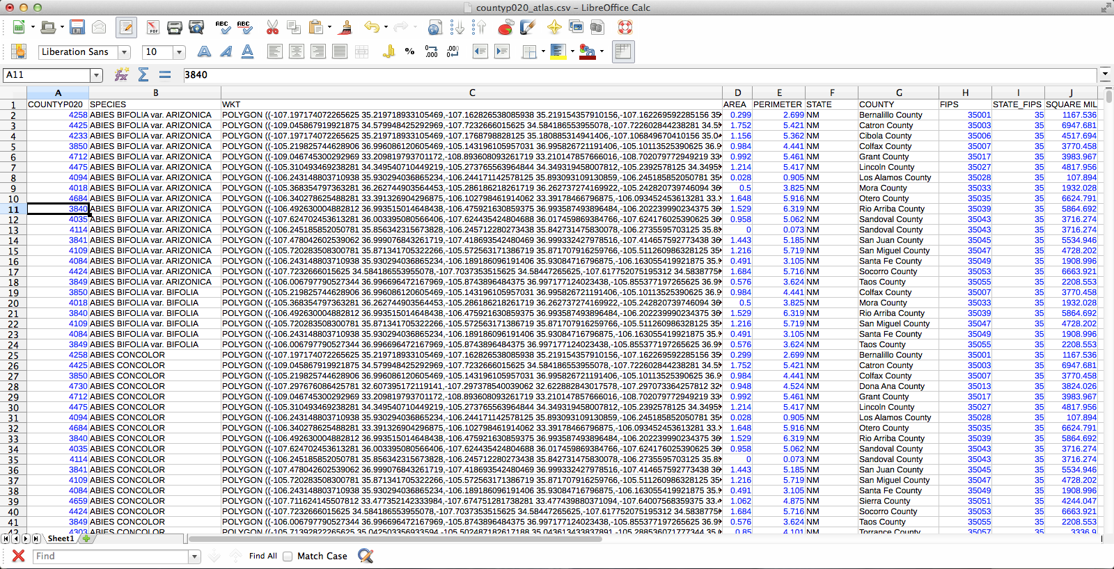
If you were wondering what these files look like, here you go. You may notice that I’m using LibreOffice for dealing with CSV files. For some reason the CSV files created by Excel are not readable by QGIS. First, the county/species CSV:
The CSV-ified county layer:
The joined layer:
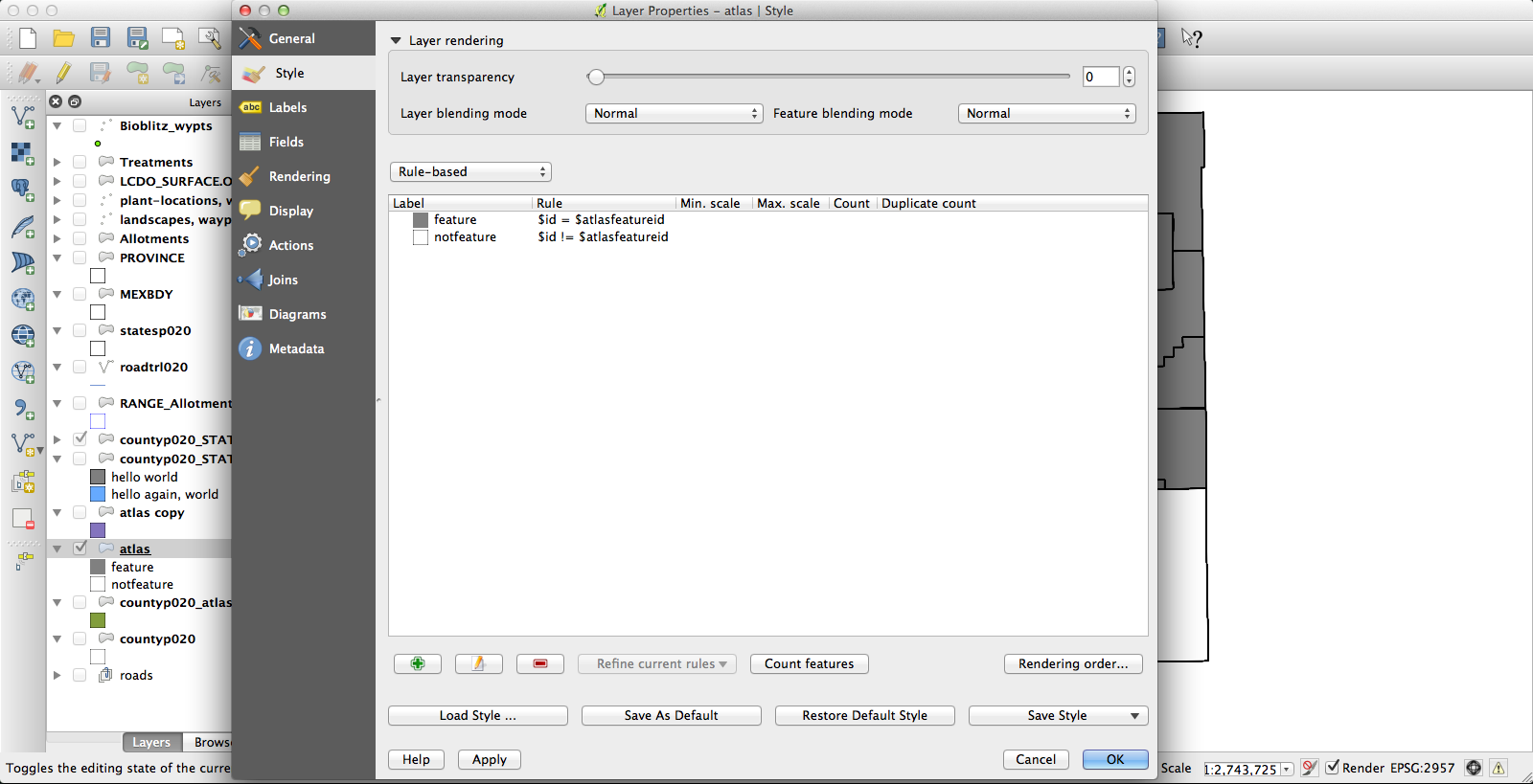
At the end of all that, I had a file that had one row for each species by county occurrence, and that row included the shape of the county in question. Progress! Next, I dissolved the layer on the “species” field, which results in the creation of a new vector layer (as a shapefile, no more CSV) in which all the various counties for each species have been conglomerated (no, I don’t know why this is called “dissolve”, since it does essentially the opposite) into a single feature. The last challenge was getting the Atlas Generator to create a separate image for each of these features. First, I set a rule-based layer style: “$id = $atlasfeatureid” (meaning “apply the style to Atlas’s current feature”) so that the current feature will be medium grey and everything else will have no fill:
I had been using the current KyngChaos build of QGIS, but the version of Atlas it uses has some annoying features–most notably, it changes the map extent to center each feature. Probably you can turn this off somehow so that the whole state remains nicely centered in each image, but if so I don’t know how. Second, I couldn’t get rule-based layer styling to work properly under the KyngChaos build (probably user error, but nonetheless…). So I tried the current nightly build from Dakota Cartography and it all worked nicely:
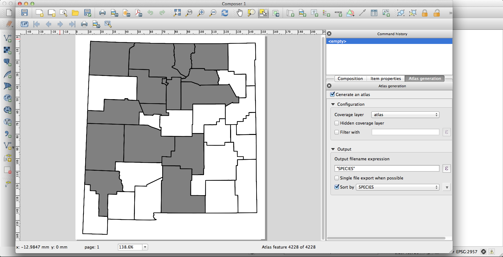
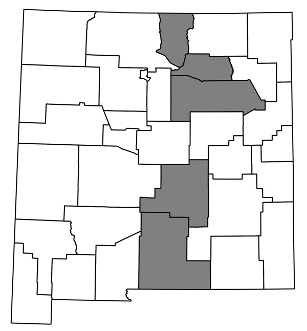
Now I have a huge pile of maps, each showing county distribution for one of the plants of New Mexico, and helpfully with file names that are just the name of the species. They look like this one, for Thelypodiopsis vaseyi:
The whole thing seems to work, and although it’s not entirely automated I think it’ll only take me an hour or so next time to go from having a new data file in Ken’s format (or a new version of my current spreadsheet; I’ve started looking through the data and making some corrections) to having QGIS plug away creating images. I’m sure it could be made more efficient if I were storing my data in a PostgreSQL database and all that, but this is close enough!